MICAELLA LANGIT


Programmer | UI/UX Designer
Bard is Broke
Description
Play as a broke Bard who fell from fame and realizes three days before their rent is due that they are low on money. The stage is yours in Tavern de Uniteus where you will have to perform music through a Rhythm Game feature to earn money. Interact and even date one of your lucky (and wealthy) fans in the audience to learn more about themself, the world beyond the tavern, or even to get help paying rent. Earn enough money by the end of the third night so that you may pay rent and not be kicked out into the streets.
My Role
For this project, I was the UI/UX Programmer and Designer. I started this project off as the sole Project Manager, however as a Programming student, I got one of the game designers on our team to Co-PM along with me. I was tasked to design and implement the UI. I also created assets for the UI and put them in the game engine.
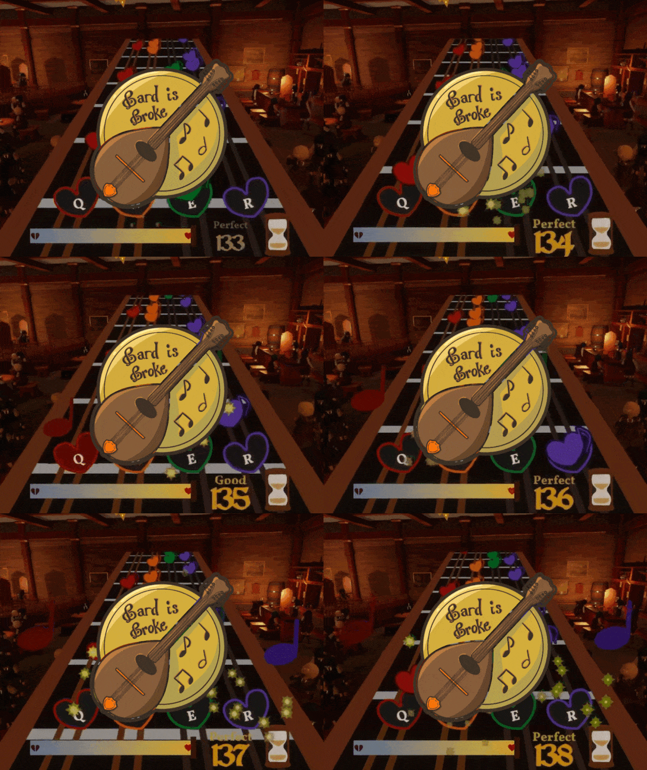
Because we decided that the rhythm game aspect was the most important part, I spent a lot of time re-iterating through different designs. Because of our game design, it was challenging to find a design that fit. In the end, I opted for a design revolving around the neck of the mandolin, our Bard's instrument of choice.


Bard is Broke is also a Visual Novel, meaning that a lot of UI design is needed. The hardest feedback I had with the beginning stages of this design was that it didn't fit with the theme of the game. I was at a crossroads between something that stands out, and something more minimalistic. Not knowing what direction to go in, and not getting much feedback from others, I decided to create many iterations to what I saw fit. In the end, this resulted in a more parchment paper looking UI that the team thought fit the aesthetic more.
I focused the main menu screen to both fit in with our tavern scenery, but also showcase the 3D models and setdressing of our 3D Artist and Level Designer. I wanted to showcase their skills as much as possible, so I decided to pan to different areas of the tavern in order to achieve this. I also decided to continue the parchment paper theme, as it really fit with the tavern in my opinion. Although I did want a transparent background to display more of the tavern, I opted against it for readability issues. I learned a lot throughout this UI/UX journey, and it made me eager to learn more about UI and how to design things better for the user.
